![]()
With some recent efforts from an excellent designer named Craig Palenshus, everyone's favorite regular expression library has received a nice visual upgrade. You'll notice the site is much cleaner and more presentable now. The overall design is excellent IMHO. The site seems to be much easier to use and navigate. The links are more clearly defined and laid out. The page is not quite so cluttered. In the past the site had been added to and altered plenty of times, and this created layers of clutter and bad layouts. Steve Smith and I have taken some time to fix some of the bugs from the previous system as well as getting some of Craig's alterations functioning well.
A long time ago on web site far, far away there was a regular expression tester that worked pretty well. Since then the client side tester broke, but no one really had the time to fix it. With the advent of the new look for the site soon coming, it was important to make sure that all aspects were functioning within the operational standards. One man, Brendan Enrick, set out on an adventure to complete the regular expression tester. It received an overhaul from its previous design. It not only works as it previously did, but the client side testing seems to functioning once again within normal parameters.
Ok so in all seriousness, I fixed up the regular expression tester on RegExLib. Let me know if you find any bugs or problems with it, and I'll see what I can do to clean them up. I hope you enjoy the new layout of that page. It worked pretty well for me. I've used it a bunch of times since I updated it. I find it a lot easier to use. I hope you feel the same way.
RegExLib has come a long way since Steve Smith first created the site in ASP.NET 1.0, and it has seen a couple of big layout changes. The first incarnation of RegExLib was red. The site has been green for the past few years, and it is staying that way for its new look.
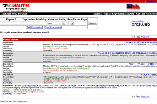
This is how the site looked near its first incarnation. This is the site back in 2003 when it was still wide and red. It was originally part of ASPSmith. This is the first view of the library as its own web site. As you will notice it was reasonably well designed. The basic layout of the site is nice. The search results aren't very clean, but they work for their purpose.

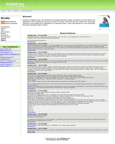
Later the site received a new design of Thomas Johansen. That layout remained for plenty of years, and it received many minor changes over the years of use. This is the nice green layout everyone has been seeing for years.

Now after trimming the fat off of the site, it is a tall, lean page with plenty to offer its users. Sections of the pages are grouped together nicely with headings. There is spacing to allow users to clearly see and use elements on the page. The RSS feed is being powered by FeedBurner so you can now see how many others are subscribing to the regular expressions on the site.

The site is more usable in my opinion. I have a much easier time reading and working with the pages on the site. I think this visual upgrade is also a very strong usability upgrade as well. I recommend you check out the new design of RegExLib.
Let us know what you think!
Comments