I’ve been using the Fiddler web debugging tool for many years now. I first picked it up just after Fiddler2 was released, and it’s been an awesome tool the entire time. This is one big reason why I was very happy when I learned last year about Telerik’s acquiring Fiddler.
Having been a part of a Telerik acquisition previously, I know that Telerik is careful not to stir things up during these types of situations. For example, they’re not the type of company to step in and throw their branding everywhere. (It will be there, but just not be too overt.) It also meant that Telerik would be getting Fiddler the support, upgrades, and growth that it needs.
My favorite part of this whole turn of events is that I got to lead the team of developers implementing the new Fiddler Website. I work with a fantastic group of people who usually don’t, but probably should, read my blog (they’d see comments like these).
I always got a good laugh when installing Fiddler on my computers. The previous site was a bit outdated. I think the problem with the previous site is just that Eric didn’t have the time for updating the site. I’d say we were all lucky he was updating the product.
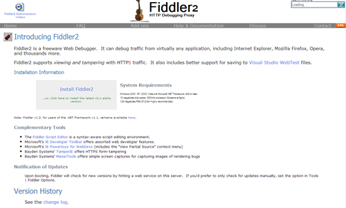
Thanks to the Wayback Machine, you can take a look at some older versions of the Fiddler site. I’ve included a screenshot of one of those here for you.
This is the type of design that I am best at. I refer to this as “Developer White”. Developers have no problem with sites like these. Some of the best tools on the Internet are hosted on sites just like this (see Fiddler for the past 5+ years). They often get a laugh here or there, and aren’t always the easiest to navigate. That download link in the middle always looked like a text ad trying to get me to download some random unrelated tool.
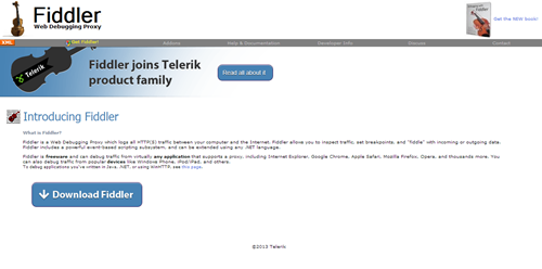
This isn’t the first update since the Telerik acquisition of Fiddler. There, of course, was a public announcement on the site for a while before we were able to start working on the upgrade. If you visited the site last week, it would have looked roughly like this.
For anyone who didn’t know, there were two places in the old Fiddler site with scrolling marquees. I kid you not. Go check out the Wayback Machine if you don’t believe me.
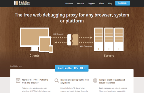
Now the Fiddler site has a new, spiffy design. Consider this a prelude of a great deal more support for this product that we all love. Hooray for Fiddler!
Please let me know what you think about the new site!
Note: I didn’t design it, and I don’t build Fiddler. I can, however, pass your feedback on to those who did.


Comments